

If you’re trying to make sense of token flows, vesting, and on‑chain activity instead of just staring at price charts, building a tokenomics dashboard is one of the most useful things you can do in 2025. Let’s walk through the landscape: what to build, which stack to pick, how different approaches compare, and where this whole thing is heading over the next few years.
What a Tokenomics Dashboard Actually Needs to Show
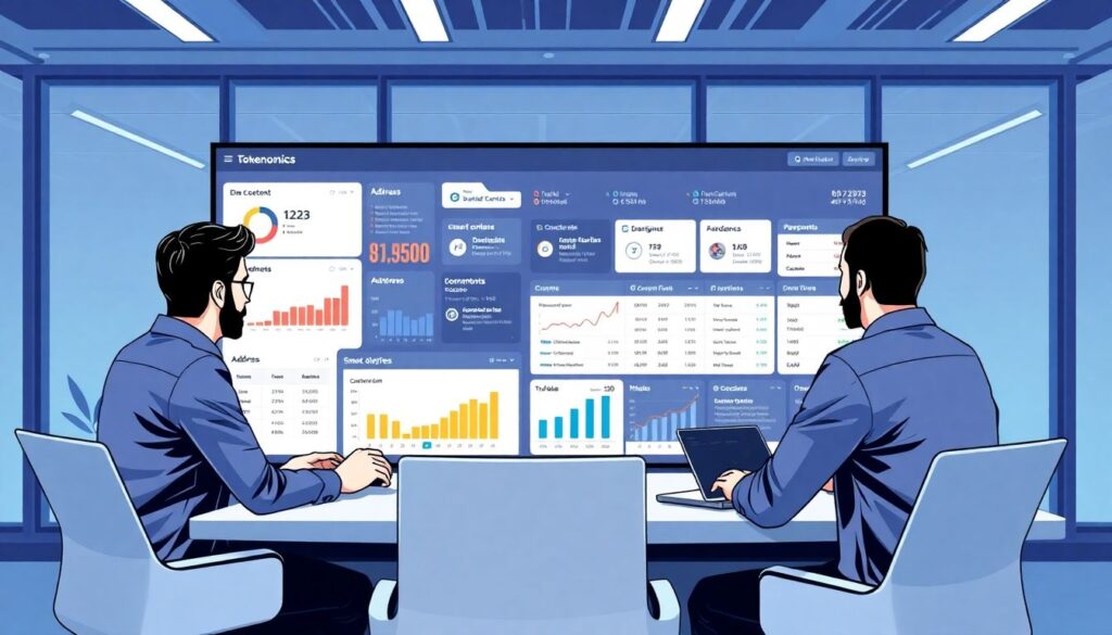
Before talking tools and stacks, you need a clear idea of what your tokenomics dashboard is supposed to answer. At a minimum, you want to track supply dynamics (circulating vs. total vs. max), unlock schedules, treasury balances, and key holders. For a serious tokenomics dashboard for crypto project teams, you usually add liquidity metrics, DEX/CEX distribution, staking participation, emissions, and runway for incentives. The goal is not “a cool chart,” but repeatable answers to questions investors, the community, and internal contributors keep asking: “Who’s unlocking when?”, “How healthy is protocol revenue vs. emissions?”, “Is token distribution becoming more decentralized or more concentrated over time?”
Three Main Approaches to Building a Tokenomics Dashboard
When you sit down to build custom tokenomics dashboard tooling, you’ll quickly discover there are basically three broad paths. First, no‑code or low‑code builders: you plug into a data provider like Dune, Flipside, or Nansen, drag charts onto a canvas, and tweak queries. Second, semi‑custom builds, where you use BI tools (like Metabase, Redash, or Power BI) connected to an indexed database from a crypto tokenomics analytics platform, often with some SQL and scripting behind the scenes. Third, a full custom web app: you run your own indexers or use raw node RPC plus third‑party APIs, store processed data in your own database, and ship a bespoke frontend. Which option is right depends heavily on your in‑house skills, budget, and how “product‑like” you need the dashboard to be.
No‑Code and Template‑Based Options
For many early‑stage teams, the easiest starting point is a tokenomics dashboard template provided by analytics platforms. You clone a template, adjust the address list for your own contracts and multisigs, and then tweak visuals. The obvious upside: you get to “something working” surprisingly fast, without a data engineer on payroll. The downsides show up as soon as your token model deviates from standard ERC‑20 + vesting contract patterns, or when you want to blend off‑chain data (team allocations, OTC deals, internal spreadsheets) into the same view. Custom logic, nuanced vesting rules, or cross‑chain aggregation quickly push you past what simple templates can do gracefully.
Pros and Cons of No‑Code Tokenomics Dashboard Software
Using ready‑made tokenomics dashboard software feels almost magical at first: connect a chain, paste a contract address, pick some charts, and you’re live. Maintenance is easier because someone else cares about indexing upgrades, fork handling, new chain support, and basic uptime. That said, the trade‑offs are real. You inherit the provider’s data model and refresh cadence; if their “circulating supply” definition doesn’t match your whitepaper, you either bend your narrative or add workarounds. Vendor lock‑in is another concern: migrating charts and formulas later can be painful. Finally, advanced security modeling (borrowed collateral, complex LP positions, restaking layers) often requires logic you can’t fully express in a drag‑and‑drop interface.
Going Semi‑Custom With BI Tools
The middle ground is using a crypto tokenomics analytics platform as your raw data backend, but exposing everything through a general‑purpose BI layer. In this setup, the analytics provider gives you cleaned, indexed on‑chain events and decoded contract interactions, and you write your own SQL models to define vesting, circulating supply, DAO treasury segments, or “risk‑adjusted TVL.” Then you connect Metabase, Superset, or Power BI to that warehouse and build dashboards. This approach offers far more flexibility than templates while remaining faster than building indexers from scratch. The challenges are non‑trivial though: someone on your team must own the data layer, keep queries efficient, and version control business definitions so “circulating supply” means the same thing for everyone across time.
Fully Custom Dashboards: Maximum Power, Maximum Responsibility
If you decide to build from scratch, you control every detail: which chains to index, how to decode contract events, how to handle reorganizations, and when to backfill history. This is the path large protocols, serious DAOs, and analytics‑heavy funds usually take. You’ll run or rent indexers, transform the raw events into token‑level facts, model tokenomics logic in code, and serve it through an API to a frontend. The strength is precision: you can implement messy real‑world vesting, exotic bonding curves, multi‑token reward systems, and cross‑domain restaking positions exactly as they work on-chain. The downside is obvious: engineering cost, operational load, and the risk of subtle bugs that skew key metrics investors rely on for decisions.
Recommended Tech Stack in 2025

In 2025, the most pragmatic approach is usually hybrid. For raw data, many teams lean on providers that offer warehouse access (BigQuery, Snowflake, Postgres) with cleaned on‑chain data. You then add a thin modeling layer (dbt or custom SQL scripts) to encode your tokenomics rules and expose an internal API. For the frontend, React remains the default, with charting libraries like Recharts or ECharts; for quick prototypes, tools like Grafana or Metabase are still highly effective. The stack you choose should match your team’s strengths: if you already have strong frontend developers but weak data engineering, prioritize managed indexing and focus energy on visualization and UX instead of reinventing ETL pipelines and chain decoders.
Key Steps to Plan Your Dashboard Build
To avoid building a pretty but useless toy, plan the project with a clear sequence. A simple outline that works for most teams looks like this:
1. Define stakeholders and use cases (core team, investors, DAO, public site).
2. List questions that must be answerable in one click (unlocks, treasury runway, emissions).
3. Choose your data sources and decide what needs off‑chain enrichment.
4. Pick an approach: template, BI, or fully custom, based on budget and skills.
5. Prototype a minimal dashboard, get feedback, and iterate before polishing visuals.
Following these steps keeps you grounded in outcomes rather than chasing “nice charts” that nobody actually uses.
Combining On‑Chain and Off‑Chain Data
A common rookie mistake is assuming everything important is on‑chain. In reality, tokenomics is full of messy off‑chain agreements: private SAFTs, advisory deals, OTC sales, CEX listings, and operational expenses. A solid dashboard must merge on‑chain flows with this off‑chain reality. In practice, that means creating a canonical list of entities (team, investors, treasury, market makers, DAO funds) mapped to wallets, plus a secure way to upload non‑public data (Google Sheets sync, CSV imports, or direct database edits with audit trails). Your modeling layer should then treat on‑chain events and off‑chain schedules uniformly, so “investor unlocks next quarter” can be shown just as clearly as an on‑chain streaming vesting contract.
Choosing Between Off‑the‑Shelf and Custom in 2025
To decide whether to lean on a tokenomics dashboard template or build fully custom, ask what will hurt more in six to twelve months: waiting on a vendor to add a feature, or hiring someone to maintain your own pipeline. If you’re pre‑launch or in the first months after TGE, a quick template‑based solution can buy you credibility and calm investor nerves fast. Once your tokenomics get more complex—multiple chains, restaking, points systems feeding into tokens, or L2/L3 expansions—you’ll probably want deeper control. Many teams start with a managed product, then slowly peel off pieces into their own stack as needs outgrow the original tool.
Security, Governance, and Transparency Considerations
Tokenomics dashboards are no longer just vanity pages; they are used by serious capital and regulators to judge how responsible your project is. That means the way you calculate and expose metrics must be auditable. Document your definitions (“what is circulating supply here?”), version them, and provide clear changelogs when formulas change. Sanitize any PII if you ingest off‑chain data, and be explicit about what’s public and what’s private. In multi‑sig or DAO‑run treasuries, consider aligning your dashboard with governance processes: for example, show pending proposals that will significantly alter token emissions or treasury allocations, and estimate their impact ahead of time.
Future Trends and Forecast: Where Dashboards Are Going
By 2025, tokenomics dashboards are shifting from static analytics into near‑real‑time decision consoles. Expect more automation: “if unlocks exceed X% of circulating supply this week, ping the risk channel” or “if protocol revenue covers less than Y% of emissions for N weeks, flag sustainability risk.” As crypto merges with RWAs, on‑chain cash flows will be tied to off‑chain assets, so dashboards will pull in oracles, legal structures, and KYC‑gated datasets. Over the next three to five years, the line between portfolio dashboards, protocol analytics, and governance UIs will blur—tokenomics views will sit in wallets, in DAO frontends, and inside every serious fund’s internal stack, not just on a public website.
Interoperability and Multi‑Chain Tokenomics
Another strong trend is multi‑chain fragmentation: L2s, app‑chains, rollups, and modular stacks mean that one token can exist across half a dozen environments. A modern tokenomics dashboard for crypto project stakeholders must handle bridging, wrapped assets, canonical vs. non‑canonical bridges, and liquidity spread across many venues. In practice, that means you’ll increasingly rely on cross‑chain indexers and standardized token metadata registries. By 2027, it’s likely that standard schemas will emerge, making it easier for one tokenomics dashboard software stack to plug into multiple ecosystems and remain accurate as bridges and rollups evolve under the hood.
AI‑Assisted Insights and Narrative Building
You’re already seeing early versions of AI copilots that sit on top of dashboards: instead of digging through charts, you ask, “How did emissions compare to fees over the last six months, and what changed after the last governance proposal?” Over the next few years, these assistants will become standard layers on top of any crypto tokenomics analytics platform. That doesn’t remove the need for a well‑modeled dataset—if your definitions are inconsistent, AI will just amplify confusion—but it does change how people interact with tokenomics. Expect queries in natural language, automated investor updates generated from underlying metrics, and simulations that show how proposed tokenomics changes might play out under different market conditions.
Practical Recommendations Before You Start
If you’re about to build custom tokenomics dashboard infrastructure, start small and ruthlessly prioritize. First, ensure your supply and unlock data are rock solid; everything else is secondary. Second, pick one or two personas (usually “internal ops” and “investors”) and design separate views tailored to them rather than one overloaded mega‑page. Third, write your definitions down as if a skeptical auditor will read them—and assume they will. Finally, treat the dashboard as a living product, not a one‑off build. Tokenomics change, new chains launch, governance evolves. Plan for continuous updates and occasional refactors, and your dashboard will grow with your project instead of turning into a dusty relic from your TGE month.