
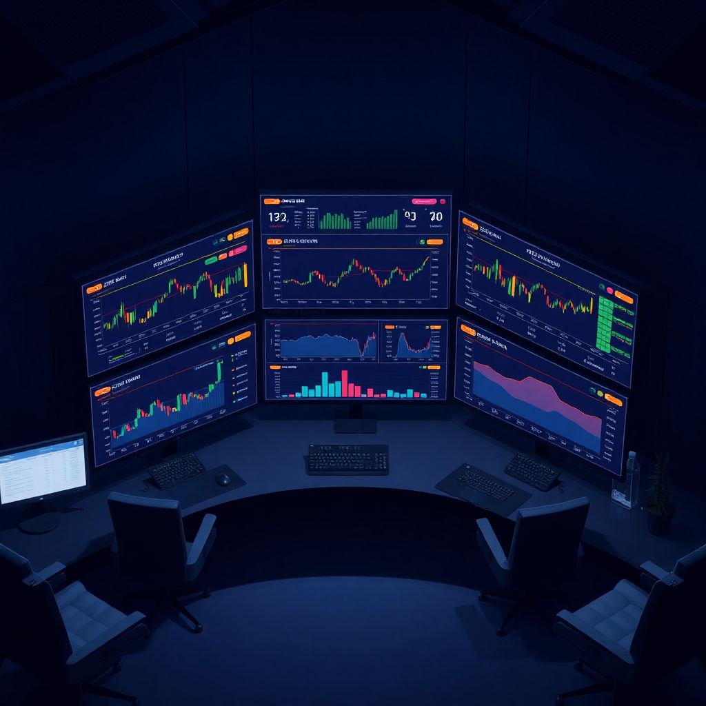
Why data visualization makes or breaks a crypto dashboard
If you’ve ever stared at a crypto dashboard and felt more anxiety than insight, you’ve seen bad visualization in action. In a market where BTC can move 5–10% in minutes and funding rates flip sentiment in under an hour, the way data is shown is as important as the data itself. Good crypto dashboard design best practices turn noisy, fragmented feeds into a mental “radar” that lets you act quickly instead of fighting with charts and widgets.
Start with questions, not with charts
Before picking colors or chart types, lock in what decisions the dashboard should support. A derivatives trader, a DeFi risk manager and a long‑term holder need different lenses on the same market. Professionals at major exchanges often start with three questions: “What do users need to notice first? What requires confirmation? What can be hidden until needed?” That hierarchy stops you from dumping every metric into the main screen and calling it “advanced.”
One dashboard ≠ one audience
Expert teams usually design separate modes or views instead of a bloated “universal” layout. For example, a day trader view focuses on price, volume, order book and liquidation clusters, while a portfolio view highlights PnL, allocation and risk. Binance and Bybit learned this the hard way: early unified views showed dozens of metrics, yet heatmaps revealed users staring at only 4–5 core areas. Splitting flows into tailored screens cut time‑to‑action and reduced misclicks in user testing by double‑digit percentages.
Visual hierarchy: what your eye should see first
In crypto dashboards, milliseconds of attention matter. Your visual hierarchy should make the “state of the market” readable in one glance. Experts often apply a simple rule: one primary signal, three to five secondary blocks, everything else tertiary. That primary signal might be total portfolio change, market breadth or BTC/ETH trend. If everything is bold, bright and animated, the user’s brain silently gives up and defaults to watching price only, ignoring risk cues completely.
Layout patterns that actually work
A battle‑tested layout follows a Z or F pattern: top‑left for the main KPI, top‑right for key controls, mid‑screen for charts, bottom for detailed tables or logs. On a best crypto portfolio tracker dashboard, that could mean total equity and daily PnL in the top‑left, filters on the right, asset allocation in the middle and transaction history below. When a major fund we worked with switched to this structure, onboarding time for new analysts dropped from days to hours, according to internal interviews.
Choosing the right visual for each crypto metric
Crypto has its own quirks: on‑chain flows, derivatives data, DEX volume, NFT activity. Throwing all of that into line charts is lazy and misleading. Volatile price data benefits from candlesticks with volume bars, while funding rates, open interest and basis trade better in smoothed line charts with subtle thresholds. Order book depth is easier to grasp with cumulative depth curves, not raw numbers. The art lies in mapping each metric to a visual that makes its structure and anomalies obvious.
Expert‑approved patterns for key indicators
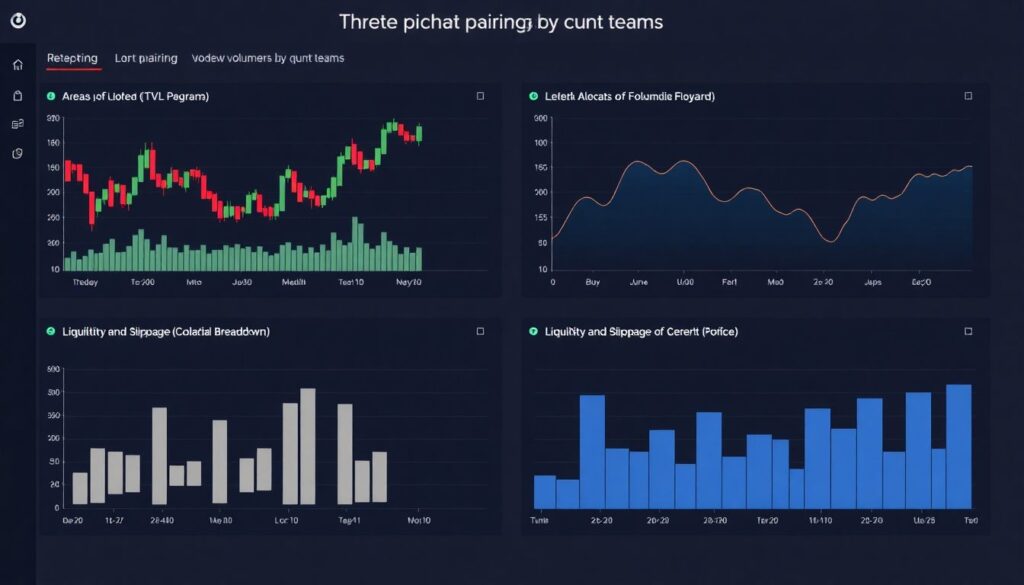
Quant teams repeatedly recommend three stable pairings: (1) candlesticks for intraday price plus volume histograms, (2) area or line charts for macro indicators like TVL, and (3) horizontal bar charts for composition such as asset allocation or collateral breakdown. For liquidity and slippage, depth charts or price ladders work better than tables. From internal A/B testing at several firms, traders reacted 20–30% faster to liquidation clusters when highlighted as overlays on price rather than hidden in side widgets.
Color, contrast and the problem of “Christmas tree” dashboards
Crypto dashboards love neon palettes, but high saturation everywhere kills clarity. For active traders checking screens in low‑light setups, harsh schemes cause fatigue and missed signals. Experts typically define a neutral base (grays), a single accent color for primary actions, and a constrained palette for data series. Reserve bright red and green for real deltas like PnL changes or liquidation alerts. When a leading exchange reduced accent colors from nine to four, usability tests showed a noticeable drop in error clicks.
Handling red/green and accessibility
Relying solely on red and green is risky: up to 8% of men have color‑vision deficiencies. Accessible crypto dashboard design best practices include combining color with shape, icons or patterns. For example, up and down moves can use arrows, while different line styles separate funding rate regimes. Technical note: target contrast ratios of at least 4.5:1 for text over background, based on WCAG guidelines. That keeps charts legible on cheap monitors and in dim trading rooms.
Timeframes, aggregation and avoiding fake patterns
Crypto never sleeps, so users constantly shift between 1‑minute and 1‑day views. If your aggregation logic is inconsistent, the same metric may tell opposite stories at different resolutions. Price, volume and funding need coherent time buckets; on‑chain flows should be smoothed to avoid interpreting a single whale transfer as a structural trend. Skilled designers coordinate bin sizes: intraday charts often use 5–15‑minute candles, whereas weekly trends get daily or 4‑hour aggregation for a less noisy picture.
Technical note: downsampling and performance
Rendering tick‑by‑tick data for pairs like BTC‑USDT in the browser is a good way to melt laptops. Mature crypto analytics dashboard software applies downsampling on the backend (e.g., using time‑series databases like TimescaleDB) and sends only aggregated series to the client. A typical practical setup: keep 1‑minute data for the last 24 hours, 5‑minute for three days, 1‑hour for longer periods. Frontend rendering uses WebGL or canvas for thousands of points, with lazy‑loading for historical zoom.
Alert design and “at a glance” monitoring
Dashboards aren’t just for passive reading; they’re control rooms. Alert design has to walk a fine line: if everything beeps, the user stops listening. Effective setups use tiers: subtle inline hints, stronger visual cues for thresholds, and only critical events get sound or push notifications. A prop‑trading desk we consulted limited real‑time audio alerts to three categories—margin risk, connectivity, and execution errors. As a result, traders reported fewer “false panic” moments during volatile sessions.
Summaries vs. raw event streams
Instead of throwing every liquidation, swap or on‑chain event into a scrolling feed, roll them into aggregates with drill‑downs. Show “$120M long liquidations in the last 15 minutes” with the option to expand into a timeline. Traders care about clusters and accelerations more than individual ticks. Technical note: implement incremental aggregation windows on the server side and stream updates via WebSocket; this reduces bandwidth and ensures consistency across different views.
From widgets to stories: building flows, not islands
A strong dashboard feels like a story: you see a spike in volatility, click to inspect drivers, then adjust positions. Weak dashboards feel like islands of data with no navigation logic. Experts design “investigation paths” directly in the UI: click PnL to jump to trade history, click funding to open per‑exchange spreads, click TVL to see protocol composition. This mimics how experienced analysts think, turning UI interactions into guided analysis rather than random clicking.
Using progressive disclosure
Progressive disclosure keeps the surface clean while making depth available when needed. For instance, your main screen shows only total realized and unrealized PnL; tap to expand asset‑level PnL; dig further to view trade‑by‑trade breakdowns. Crypto trading dashboard UI UX design services frequently rely on this pattern for professional clients, because it prevents “instrument panel overload.” In usability studies, traders consistently preferred fewer primary widgets with drill‑downs over cluttered one‑screen “power dashboards.”
Choosing and integrating cryptocurrency data visualization tools
Under the hood, dashboards live or die by their visualization stack. Teams building from scratch usually combine charting libraries like TradingView, D3.js or lightweight‑charts with real‑time websockets and caching. Off‑the‑shelf cryptocurrency data visualization tools can accelerate delivery, but only if they match your latency and customization needs. If you’re pulling on‑chain, order book and derivatives data from multiple venues, you’ll also need a normalization layer to unify timestamps, symbols and quote currencies.
Technical note: data quality and reconciliation
Inconsistent data destroys trust quicker than any visual trick can fix it. Mature setups implement reconciliation: cross‑checking prices, volumes and balances across at least two sources. For example, portfolio balances are verified against both exchange APIs and internal ledgers, flagging discrepancies above 0.1%. Latency budgets are explicit: 100–300 ms for order book updates is typical for pro trading dashboards, while portfolio views can tolerate a few seconds. Logging and metrics around data freshness are surfaced in the UI for transparency.
Best practices specific to portfolio dashboards
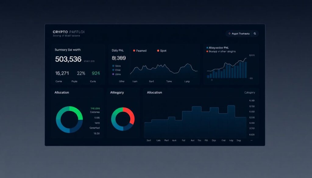
A best crypto portfolio tracker dashboard must answer three questions instantly: “How much am I worth? Where is the risk? What changed since I last checked?” That means a compact top‑line summary (equity, daily PnL, realized vs. unrealized gains), a clear allocation view by asset and category (spot, derivatives, staking, DeFi) and a change log. Long‑term investors care more about drawdowns and Sharpe ratios than one‑minute candles, so design the experience around trend clarity, not tick‑by‑tick drama.
Risk, exposure and scenario views
Sophisticated users expect exposure not only by coin but by factor: BTC beta, stablecoin concentration, protocol risk. They also want quick “what if” tools: “What happens if ETH drops 20% and yields compress by 2%?” Technical note: scenario visualizations typically precompute sensitivities (e.g., DV01‑style metrics for options or interest‑bearing tokens) and apply them client‑side when sliders change. Simplified traffic‑light cues—green for resilient, red for fragile—guide users without drowning them in Greeks.
Performance, responsiveness and mobile realities
Most active traders glance at dashboards from multiple devices throughout the day. Mobile layouts can’t just be shrunk desktop versions; they need re‑prioritized content. On phones, show a minimal “vital signs” pack: total equity, top positions, current PnL and maybe one compact chart. Deeper analysis belongs to tablet or desktop. Teams that designed mobile first reported higher daily active usage, because users dared to open the app more often, knowing they wouldn’t face information overload.
Technical note: rendering and interaction
High‑frequency chart updates can drain batteries and CPU on laptops and phones. Efficient crypto analytics dashboard software throttles updates, uses requestAnimationFrame in the browser and avoids unnecessary re‑renders in frameworks like React or Vue. Hit targets for taps need to be at least 40–44 px on touch devices to prevent mis‑taps when the market is moving fast. Gestures—pinch to zoom, horizontal swipe to switch pairs—should be consistent across all charts for muscle‑memory building.
Checklist: practical steps to improve any crypto dashboard
1. Define the top three decisions your users make, and build the main screen around them.
2. Reduce colors to a primary accent and a small, meaningful palette.
3. Map each metric to the most honest visual type instead of defaulting to lines.
4. Normalize timeframes and aggregation so charts tell consistent stories.
5. Implement progressive disclosure for depth without clutter.
6. Add reconciliation and freshness indicators to rebuild data trust.
7. Test layouts with real traders under stress, not just in design reviews.
Bringing it all together
The best crypto dashboards feel calm even when the market is chaotic. They respect attention, show only what matters right now and let users dig deeper on their own terms. Whether you’re choosing cryptocurrency data visualization tools for a new platform or hiring crypto trading dashboard UI UX design services to upgrade an existing one, judge everything by a simple yardstick: does this visualization shorten the path from signal to decision? If the answer is no, it’s noise—no matter how pretty the chart looks.