

Why crypto data storytelling hits different
If you pitch a SaaS startup, you can lean on familiar metrics: MRR, churn, CAC. In crypto, you walk into a room where half the people check on-chain metrics during your talk, and the other half are still confusing TVL with market cap. That’s why data storytelling techniques for crypto audiences matter so much: you’re not just showing numbers, you’re building a bridge between on‑chain reality, business narrative and perceived token value. Instead of dumping charts from Dune and hoping for the best, you need a story arc: context, tension, inflection point, evidence, and outcome. The more speculative the space feels, the more investors demand concrete behavior on-chain, so your story has to translate messy blockchain activities into a coherent thesis about growth, retention, and risk.
Core principles of data storytelling for crypto people
Start with a thesis, not a dashboard
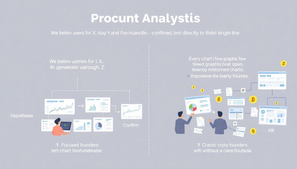
Before touching any graph, write one sentence: “We believe users come for X, stay for Y, and generate value through Z.” That’s your hypothesis. Every chart exists to confirm, nuance, or kill this line. Crypto founders often reverse this: they open five tabs, pull twenty charts, and improvise. Instead, imagine you’re guiding a skeptical LP through a dense forest of on-chain events. You choose the trail in advance: awareness and acquisition, then engagement, then monetization, then defensibility. That structure helps decide which metrics actually matter and prevents you from overwhelming people with noise. When the story is thesis‑first, even non‑technical stakeholders can follow how you moved from raw blockchain data to a clear investment case.
Translate on‑chain metrics into human behavior
Most audiences don’t emotionally react to “daily active wallets” or “contract calls per address.” They react to behavior: “power users who come back three times a week and bridge capital in from elsewhere.” Good crypto data storytelling techniques focus less on jargon, more on what people actually do. Show how a wallet evolves: first bridge, first swap, first interaction with your staking or NFT module. Connect phases with narrative language: “exploring,” “trying,” “committing,” “expanding.” When you talk about retention curves, describe what held them: lower friction, stronger incentives, social proof, or superior UX. That translation layer is what turns a flat time series into a recognizable customer journey that investors can compare with other digital products they know well.
Context beats absolute numbers
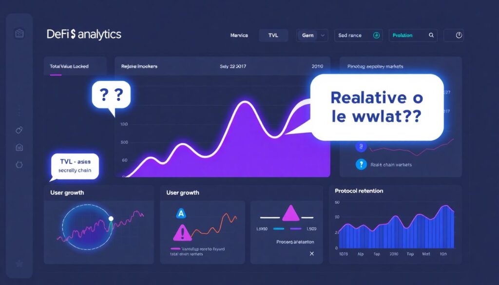
A TVL chart going up looks great until someone asks, “Relative to what?” In volatile markets, raw counts mislead very quickly. You need denominators and benchmarks: TVL as a share of segment liquidity, user growth versus overall chain activity, retention versus benchmark protocols. If your fees grew, was it market beta or unique value? If active wallets dropped, did gas spike or did competitors ship a better product? Strong storytellers frame everything in relation to a baseline: market cycle, competing protocols, or internal expectations. This is how you avoid overclaiming in bull markets and stay credible in drawdowns. Over time, investors remember founders who contextualize risk and uncertainty instead of hiding behind cherry‑picked screenshots from the last three months.
Inspiring real‑world style examples (de‑anonymized patterns)
Case 1: From “random NFT project” to ecosystem growth story
A mid‑2022 NFT project on a major L2 chain came to a crypto marketing agency for data‑driven storytelling, worried they were “just another collection.” Instead of leading with floor price, the team rebuilt their narrative around creator retention and secondary ecosystem activity. They linked contract calls, marketplace trades, and interactions with partner dApps to show that minters didn’t just flip and leave. A significant slice of collectors kept minting derivative art, joining governance experiments, and bootstrapping a small on‑chain creator economy around the brand. Presenting this, they highlighted how each new drop turned into a funnel for community‑built tools. That data‑backed narrative helped them secure a partnership with a large gaming guild that was initially dismissive of “JPEGs” but responded strongly to evidence of durable network effects.
Case 2: DeFi protocol reframes “yield farm” as risk engine
A small DeFi protocol offering structured products struggled with perception: investors lumped them into the generic “degenerate yield” bucket. Internally, they had a sophisticated risk engine, but few outside people understood it. Working with an analytics consultant, they extracted three key datasets: historical performance of strategies versus simple holding, risk exposure by asset and duration, and user cohorts who consistently sized up positions. The data story focused on how conservative users tested with small positions, saw lower drawdowns relative to benchmarks, and gradually increased allocation. Visualizing drawdown distributions and survival rates made it clear this was closer to a risk‑managed product than a casino. That shift in framing, built directly from on‑chain evidence, helped them bring in a traditional family office that had never allocated to DeFi before.
How to present crypto data to investors and stakeholders
Design the “three‑slide spine” first
Before you open any business intelligence tool, sketch three slides on paper: current state, engine of growth, and upside with risk. First, summarize where you are: volume, key user segments, main chains. Second, show the engine: which behaviors most reliably create value (cross‑chain inflow, repeat swaps, recurring staking, or referrals). Third, outline upside and constraints: how big the reachable market is, and what limits growth today (gas, liquidity, regulation, UX). With this spine, you can decide which charts must appear and which can stay hidden in backup. When people ask how to present crypto data to investors and stakeholders, the answer is almost never “more charts”; it’s “a smaller number of well‑chosen snapshots that map cleanly to your investment thesis and your execution plan.”
Choose visuals by question, not by aesthetics
Pie charts look cute, but they’re awful for tracking changes over time. In crypto, most important questions are temporal and behavioral: how something evolved, when an inflection occurred, what changed after a product launch. Line charts and cohort heatmaps usually outperform everything else here. If you’re comparing user segments, use stacked areas or grouped bars with clear labels and callouts. When you display risk or volatility, show ranges and tails, not just averages, so people see downside. Ask yourself, “What question is this slide answering?” and delete any visual that doesn’t respond to a clear, decision‑relevant question. In noisy sectors like DeFi or GameFi, an investor’s attention is precious; you win it by making every chart feel necessary and immediately interpretable, even on a small laptop screen.
Tell the market story, not just your story
Investors rarely bet on isolated projects; they bet on narratives: L2 scaling, restaking, modular blockchains, real‑world assets, decentralized social. Your data should show how you ride or reshape a broader wave. Instead of bragging “our volumes tripled,” show volumes versus growth of the underlying chain, or versus the rest of your category. Demonstrate that you’re either outpacing peers or deliberately occupying a resilient niche. If your usage dipped in a bear market but less than your competitors, that resilience is a story. If retention outperforms despite lower emissions, that’s a strong signal of product‑market fit. Framing your metrics within macro and sector dynamics also signals to sophisticated LPs that you think in systems, not just local milestones.
Tools and setups that actually help
Choosing data visualization tools for cryptocurrency projects
You don’t need a massive data team to tell a good story, but you do need a sober stack. Off‑the‑shelf analytics like Dune, Flipside, Nansen, or Chainbase handle on‑chain queries, while generic BI tools help unify off‑chain data from your app, CRM, and marketing campaigns. The goal isn’t fancy visuals; it’s repeatability. Design a standard set of views you revisit monthly: user acquisition by source, retention cohorts, capital flows, and protocol health indicators. The best crypto analytics dashboards for investor presentations are boring in the right way: consistent layout, the same key charts every time, and trend lines long enough to show full cycles. Over time, these dashboards become the evidence base from which you derive concise stories for pitch meetings, blog posts, and governance proposals.
When to bring in specialized services
Early on, a founder or product lead can handle exploration. As your data footprint grows across chains, wallets, and integrations, it often pays to use crypto data storytelling services for blockchain startups. These specialists understand quirks like MEV, bridging anomalies, or sybil behavior and can separate real demand from inorganic patterns. Instead of just building one‑off decks, good partners help you define a core metric framework that you can own going forward. Look for people who challenge your assumptions, not just create prettier slides. If every number in the first draft confirms your priors, you’re probably not digging deep enough. Constructive friction around metrics early helps you avoid embarrassing moments later, when a potential lead investor pokes holes in your numbers during due diligence.
Developing your own data‑driven storytelling skills
Practice narrative “compression” weekly
A simple habit: once a week, take your latest metrics snapshot and force yourself to write a three‑sentence update. First, what changed meaningfully. Second, what you think caused it. Third, what you’re going to test next. Share this with your core team or advisors and invite brutal feedback. Over time, you’ll get better at distinguishing signal from noise and at speaking clearly about uncertainty. This discipline helps you resist the temptation to over‑index on short‑term token price moves or vanity metrics and pushes you to anchor every conversation in user and liquidity behavior. Founders who do this consistently become far more confident under questioning, because they’ve already rehearsed and refined their explanation of each major movement in the data.
Reverse‑engineer great decks and threads
Study public investor memos and pitch decks from well‑known protocols and infrastructure players. Try to reconstruct their story: what they chose to show first, which metrics they highlighted, where they acknowledged risk. Ask yourself what questions you’d ask if you were on the other side of the table. Then apply the same interrogation to your own materials. This kind of reverse‑engineering trains your eye for pacing, emphasis, and omission. Over time, you’ll see patterns: winning decks rarely hide their weak spots; they frame them, quantify them, and show a path to improvement. That honesty, backed by real numbers, builds more trust than artificially smooth charts. Once you see these patterns, you can adapt them to your own stage and segment without copying anyone’s aesthetics.
More real‑world‑style success cases
Case 3: L2 wallet app cleaning up messy retention

A consumer wallet on a popular L2 chain had a classic growth problem: download spikes after campaigns, followed by sharp drop‑offs. At first, every investor pitch leaned on total downloads and aggregate transaction counts, which looked fine. When they finally did a cohort analysis, they discovered a tiny subset of users driving most long‑term activity, especially those who signed up through a specific educational partnership. They rebuilt their story around these power cohorts, showing how teaching users about gas, bridges, and DeFi primitives produced deeper engagement. Instead of promising “mass adoption,” they framed the next 18 months as a deliberate push to scale this education‑driven funnel. That narrative, rooted in granular data, resonated far more with serious backers than vague talk about going viral.
Case 4: RWA protocol proving boring can be good
A real‑world‑asset lending protocol looked “unexciting” compared to double‑digit APY farms. Their growth was slow but consistent. Rather than apologize for it, they leaned into the data: default rates near zero, stable utilization, conservative LTVs, and a user base dominated by repeat lenders increasing ticket sizes over time. Their story became, “We are the boring, reliable bond desk of DeFi,” illustrated with time‑series charts showing steady, unlevered returns through volatility spikes that wrecked other platforms. For risk‑sensitive investors, this data‑centered framing was precisely what they wanted. It helped the team close a round mainly from TradFi backgrounds who were allergic to flashy yields but understood credit risk intimately and appreciated transparent, longitudinal evidence.
Where to learn and stay sharp
Technical and storytelling resources
To keep leveling up, combine technical and narrative learning. On the technical side, explore documentation and community hubs from on‑chain analytics platforms and experiment with your own queries; nothing beats pulling and cleaning your own data. On the storytelling side, study books and blogs on narrative structure, decision‑driven analytics, and visualization best practices. Many threads and long‑form posts by crypto researchers effectively serve as informal masterclasses in how to frame complex metrics for non‑experts. Over time, you’ll notice recurring moves: starting with a crisp question, revealing an unexpected insight, then carefully walking through implications. Adopting these habits will make your own updates, investor notes, and governance posts more compelling and easier to act on.
Learning from agencies and communities
If you’re not ready to hire a full‑time team, watch how a seasoned crypto marketing agency for data‑driven storytelling operates in public: case studies, breakdown threads, and open‑sourced dashboards are often out there if you look closely. Join analytics‑oriented Discords and forums where data people from different protocols compare methods, sanity‑check each other’s queries, and share techniques. When you see someone present a clean, persuasive argument about usage or risk, dissect it: how do they sequence evidence, how do they handle caveats, what do they leave for Q&A? Finally, remember that tools are just amplifiers. Data visualization tools for cryptocurrency projects, no matter how powerful, won’t save a weak thesis. The real leverage comes from a founder or team that can look at raw on‑chain reality, extract the few numbers that truly matter, and turn them into a story smart people want to bet on.