

Why liquidity quality matters more than “TVL looks big”
When people talk about DeFi liquidity, they usually point at TVL or 24h volume and call it a day. That’s dangerously shallow. Quality liquidity is about how easily size can move through a pool without wrecking the price, how fast that liquidity can disappear in stress, and how well it’s distributed across time and venues. Measuring it means going beyond dashboards and asking: what happens if the market gaps, a whale unwinds, or incentives end overnight? Different approaches focus on different slices of this puzzle: some look at depth and slippage curves, others at smart‑contract and counterparty behavior, others at on‑chain activity patterns. The trick is to combine these lenses into a practical framework you can actually trade and risk‑manage with, not just a pretty chart you post on Twitter.
How to analyze DeFi liquidity pools beyond TVL and APR
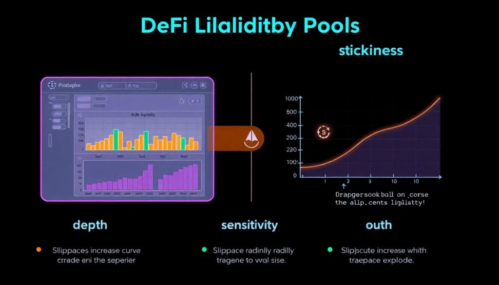
If you want to understand how to analyze DeFi liquidity pools properly, start with three basic dimensions: depth, sensitivity, and stickiness. Depth is the obvious one: order‑book or AMM curve liquidity near the mid‑price for different trade sizes. Sensitivity is how quickly slippage explodes as you push size or as volatility spikes. Stickiness is whether LP capital tends to run at the first sign of trouble or stays put through drawdowns and fee droughts. A decent defi portfolio tracker with liquidity analysis helps here, but you still need to look at historical changes in pool balances, incentive schedules, and realized volatility. Two pools can show similar TVL yet behave completely differently when a single large trade hits; the difference is usually visible in past rebalancing patterns and the shape of the price‑impact curve around realistic trade sizes.
Case study: same token, very different execution outcomes
Take a real scenario traders often bump into: a mid‑cap token listed on a DEX v2 pool, a v3 concentrated pool, and an aggregated liquidity route via a DEX aggregator. Nominal TVL looks healthy across all three, but execution differs radically. On the v2 pool, slippage for a $50k swap might already hit 2–3%, while the v3 pool handles that size gracefully as long as you trade inside the main liquidity band. Under stress, though, when price jumps outside that band, concentrated LPs pull or reposition quickly and effective liquidity vanishes. Meanwhile, the aggregator patches routes across multiple shallow venues, creating decent average price but exposing you to multi‑hop smart‑contract risk. A robust defi liquidity risk assessment service will actually flag these regime shifts, while a basic dashboard will keep pretending the pools are interchangeable because it never tests scenarios.
Metrics and tools: from dashboards to full analytics stacks

Most users start with best defi liquidity analytics tools that show slippage for different trade sizes, AMM curves, and historical volume. That’s a good baseline, but it’s still surface‑level. Higher‑end setups treat liquidity like a time‑series problem: they track depth around mid‑price at multiple bucket sizes, latency between oracle updates and trades, reaction speed of LPs to yield changes, and cross‑venue fragmentation. An on-chain liquidity data analytics platform can combine DEX trades, pool state, and even MEV patterns to show when “visible” liquidity is regularly front‑run or sandwiched, effectively making it more expensive than it looks. The more your strategy depends on timing and leverage, the more you care about this microstructure view; without it, you’re optimizing entries based on numbers that assume you trade in a vacuum with no adversaries.
Non‑obvious signals: what pros quietly watch
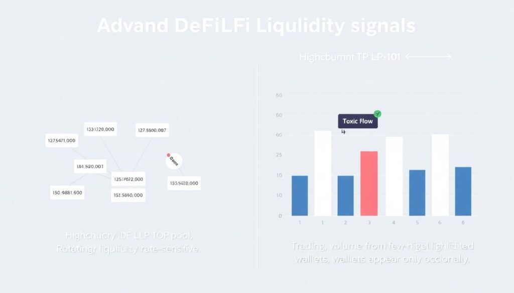
Some of the most useful liquidity quality signals rarely appear in marketing decks. One is churn of LP addresses: if a pool’s top LPs rotate every few days, that liquidity is mercenary and highly rate‑sensitive. Another is the share of volume coming from a few “toxic” flow wallets that only show up when volatility spikes; if that fraction is high, expect LPs to widen or pull in stress, turning good conditions into a trap. Correlation of pool balance changes with external funding rates is also underrated: if LPs yank capital every time centralized exchanges crank up leverage incentives, your execution risk is tied to CEX dynamics, not just on‑chain factors. These non‑obvious angles don’t replace classic metrics, but they reveal how quickly the apparent depth can collapse exactly when you try to size up.
Alternative methods: simulations, stress tests, and cross‑venue views
Beyond static analytics, serious teams build simulations. They replay historical days with your intended order sizes to see realized slippage versus quoted, including gas, MEV loss, and failed transactions. Comparing DEX‑only routes to hybrid CEX–DEX execution gives a much clearer picture than any single‑venue snapshot. Some quants even inject synthetic “shock days” into their models, bumping volatility, cutting incentives, and simulating LP outflows to see how quickly pools hollow out. This kind of alternative method matters because DeFi liquidity is path‑dependent: the order in which blocks print, oracles update, and LPs move capital changes outcomes. No best‑looking dashboard will tell you how your strategy behaves across those paths; you either backtest them deliberately or accept that your risk view is based on a single calm‑market photograph.
Real‑world workflows: how professionals actually use tools
In practice, professionals don’t rely on a single defi liquidity risk assessment service or magic metric; they stitch together multiple layers. A typical workflow: a defi portfolio tracker with liquidity analysis surfaces current exposures by asset, venue, and curve type; a separate on-chain liquidity data analytics platform monitors depth and fragmentation in real time; custom scripts compute trade‑size‑dependent slippage curves for each target pair. Before deploying size, they run dry‑run transactions on test sizes, check gas and MEV patterns, and observe how aggregators route orders. The decision whether to trade on a concentrated pool, a stableswap, or a cross‑chain bridge pool becomes a risk choice, not just a question of who shows the best mid‑price in that instant. Over time, logs of actual versus expected execution become the feedback loop that refines all subsequent liquidity quality assumptions.
Pro lifehacks for measuring and surviving liquidity shifts
A few practical tricks can save a lot of money. First, always benchmark your slippage not just against pool quotes but against what you would have paid last week and last month; sudden degradation with flat TVL is a red flag for hidden LP flight or MEV pressure. Second, never trust a route that looks too good on a single aggregator; compare at least two and, for size, break orders into time‑staggered slices while monitoring live depth. Third, watch governance and incentive calendars: many “mysterious” liquidity holes appear right after reward epochs end or vesting cliffs unlock. Finally, log every large trade with pre‑trade expectations and post‑trade reality. Over a few weeks you’ll have your own empiric liquidity map, often more honest than what any polished best defi liquidity analytics tools front page wants you to believe.