
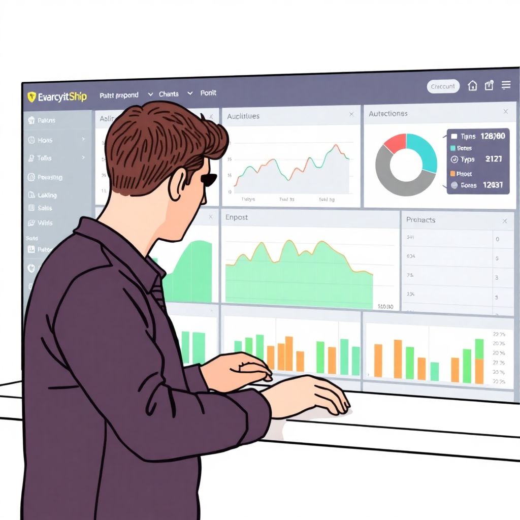
To build an accessible crypto analytics platform for non-technical users, focus on three pillars: plain-language metrics, forgiving interaction patterns, and strong safety defaults. Start with a small, opinionated feature set, validate it with real beginners, then layer in advanced detail via progressive disclosure rather than dense, trader-style dashboards.
Core accessibility principles for crypto analytics
- Design for a first-time user who has never opened a trading terminal and may only own crypto via an exchange app.
- Translate blockchain data into everyday questions such as “Is my portfolio doing better than last week?” instead of raw on-chain metrics.
- Favor simple, guided flows over dense dashboards; reveal complexity only when requested.
- Make risk, fees, and data freshness obvious and non-technical, with visual cues and short explanations.
- Apply accessibility standards (WCAG, keyboard navigation, color contrast) from day one, not as polish.
- Default to safe behaviors: read-only analytics first, with clearly separated actions like sending or trading.
Defining non-technical user personas and critical journeys
Goal: Decide who you are building for and which journeys must be effortless before you touch data pipelines or UI components.
Focusing on a narrow audience lets you create an actually easy to use cryptocurrency analytics tools set, instead of a confusing “does everything” cockpit.
When this approach fits
- You aim to be a crypto analytics platform for beginners, not a pro trading terminal.
- Your users know basic finance (balances, deposits, returns) but not blockchain specifics (gas, mempools, MEV).
- Most users connect a single wallet or exchange account and rarely rebalance.
- You prioritize trust, clarity, and safety over maximum indicator depth.
When to reconsider or narrow scope
- If your primary target is algo traders or quant funds, they expect raw feeds and complex controls, not heavy abstraction.
- If you cannot commit engineering capacity to data quality and latency, keep scope small and avoid real-time trading features.
- If regulatory constraints prevent you from giving basic risk explanations, limit functionality to neutral, historical analytics.
Persona checklist
Must-have personas for non-technical focus:
- Curious first-time holder: Bought one or two coins on a centralized exchange, wants to “see how I’m doing” across apps.
- Cautious long-term saver: Holds BTC/ETH plus one stablecoin, cares about long horizons and downside risk.
- Active dApp user (light technical): Uses a few wallets and chains, but still prefers simple guidance to jargon.
Critical journeys to map in detail:
- Connecting the first wallet or exchange account.
- Seeing a unified, understandable portfolio view within seconds.
- Answering “Did I gain or lose over period X?” with one glance.
- Understanding what a specific asset is and why it moved.
- Spotting unusual risk (smart-contract risk, volatility, concentration).
Write each journey as a short narrative (“Anna installs the app, connects Coinbase, and within 10 seconds sees…”) and use these narratives to evaluate every UX and data decision.
Translating blockchain data into clear, actionable metrics
Goal: Turn noisy on-chain and exchange data into a small set of stable, user-centered metrics that power a user friendly crypto trading and analytics platform.
Inputs and tools you will need
- Data sources: At least one reliable multi-chain provider (for wallet data), plus exchange APIs for balances and trades.
- Pricing feeds: Aggregated spot prices and, ideally, OHLC candles to compute simple performance over time.
- Reference data: Token metadata, logos, descriptions, and risk labels to avoid showing anonymous “unknown token” entries.
- Compliance constraints: Clear internal guidance on what you can or cannot label as “advice” in your jurisdiction.
Designing user-facing metrics
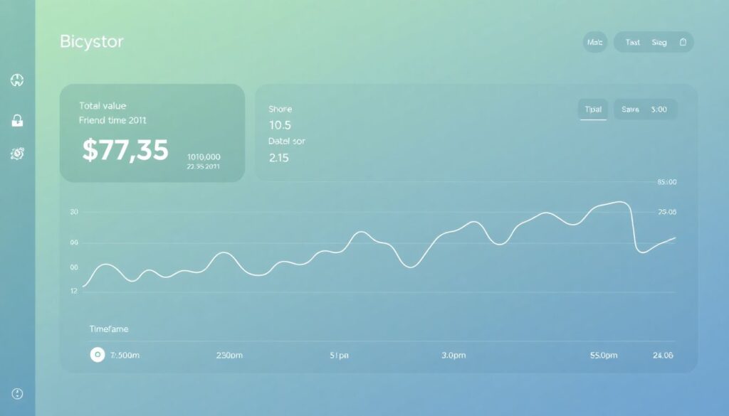
For a best crypto portfolio tracker for non technical users, bias toward a compact set of metrics:
- Current portfolio value: Aggregated across wallets and exchanges, with last update time in plain language (“Updated 2 min ago”).
- Change over time: Simple absolute and percentage change for 24h, 7d, and 30d, with tiny sparkline rather than complex charts.
- Allocation breakdown: By asset and category (e.g., “Blue-chip,” “Stablecoins,” “Other”) using clear colors and labels.
- Risk exposure: Human-readable tags such as “High volatility,” “Smart-contract risk,” or “Centralized exchange custody.”
- Cost basis and P&L (if data permits): Net invested vs current value, avoiding tax advice; phrase as “You put in / Current value.”
Acceptance criteria for each metric:
- Explainable in one sentence with no jargon.
- Computed consistently across chains and sources.
- Visible uncertainty: when data is partial or stale, show clear warnings instead of silent approximation.
- Tested with at least 5 real non-technical users who can paraphrase what it means without guidance.
Interface patterns for discoverability and progressive disclosure
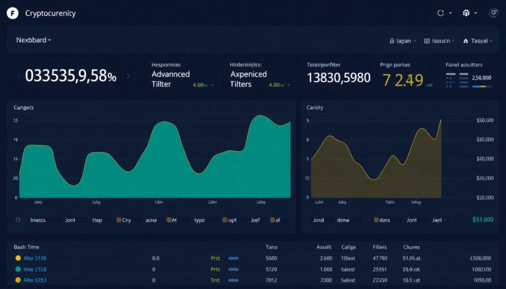
Goal: Design flows and screens that feel like easy to use cryptocurrency analytics tools, with complexity safely hidden behind clear affordances.
Preparation checklist before designing flows
- Pick one primary surface (web app, mobile app, or both) and prioritize it; don’t start with three layouts.
- Define a “day-one” scope: connect, view portfolio, view basic performance, and see simple risk hints.
- Choose an information hierarchy: Portfolio > Asset detail > Transaction detail.
- Decide where to place “power user” features so they do not distract beginners (e.g., advanced tab, collapsed panels).
- Establish accessibility constraints early: minimum font sizes, contrast ratios, and tap target sizes.
-
Start with a calm, single-focus home screen
Show only the essential: total portfolio value, key change over time, and clear entry points (“View assets,” “Connect account”). Avoid showing order books or tickers by default.
- Use large, readable numbers with thousand separators.
- Add a short subtitle that explains what the screen represents in plain language.
- Include a visible “What am I seeing?” link to a brief explanation panel.
-
Use guided connection flows for wallets and exchanges
Instead of a grid of logos with no context, guide users through a step-by-step connection wizard with reassurance and clear boundaries.
- Explain in one sentence what permissions you request (“We can view your balances and history, but cannot move funds.”).
- Show progress (“Step 2 of 3: Authorize connection”).
- Offer a test or demo mode for users not ready to connect real accounts.
-
Organize portfolio as cards with progressive detail
Each asset should appear as a simple card with name, logo, current value, and basic change. Tapping or clicking a card reveals deeper analytics on a new screen or expanded panel.
- Avoid dense tables on first view; tables can live under an “Advanced view” toggle.
- Use readable labels like “Amount you hold” instead of “Balance.”
- Display risk tags as badges with tooltips or short info modals.
-
Apply layered charts with clear, friendly defaults
Default to one simple line chart for total portfolio value over a short range. Only show toggles for multiple ranges and benchmarks once the user expresses interest.
- Pre-select only one time range (e.g., 30 days) and avoid cluttered multi-series charts by default.
- Label axes in plain language (“Portfolio value (USD)” instead of symbols).
- Provide a “What affects this line?” explanation linking to education content.
-
Separate “view-only analytics” from “trade or send” actions
For a truly user friendly crypto trading and analytics platform, visually separate analytical areas from any actions that move funds.
- Use different sections or tabs (“Overview,” “Insights,” “Actions”).
- Require an extra confirmation step and clear wording when transitions lead to trading or sending flows.
- Do not place “Sell” or “Send” buttons next to charts without spacing and distinct styling.
-
Embed micro-education in context
Short contextual helpers beat long docs. Connect every unfamiliar term to a one-line explanation directly beside it.
- Use inline “i” icons or underlined phrases that open small, focused popovers.
- Provide analogies to everyday finance (“similar to a savings account balance”).
- Track which helpers users open most and simplify those features further.
Engineering foundations: ingestion, normalization, and latency targets
Goal: Make the engine behind your crypto analytics software for retail investors reliable, predictable, and safe before scaling features.
Implementation quality checklist
- Ingestion services can tolerate provider hiccups, with graceful degradation and clear “data is updating” notices instead of silent gaps.
- All balances and transactions from different chains and exchanges are normalized into a single internal schema with explicit source tags.
- Portfolio value is recomputed consistently with one price source of truth per asset and documented fallbacks.
- Latency targets for key flows are defined and met (e.g., first portfolio view after connect completes quickly enough for a smooth experience).
- Data freshness indicators are implemented at both global (top of screen) and local (per asset or metric) levels.
- Backfilling jobs are idempotent and observable; rerunning a sync will not duplicate or corrupt historical data.
- Every external API call, failure, and retry is logged with correlation IDs for debugging user-reported discrepancies.
- Security reviews cover credential storage, API keys, and wallet connection flows, with no secrets baked into client code.
- Read-only data access is technically enforced where promised (no hidden write scopes that contradict user messaging).
- Feature flags exist for risky or experimental analytics so you can roll back quickly without downtime.
Trust, safety, and privacy controls tailored for lay users
Goal: Protect users from misinterpretation, overconfidence, and privacy leaks that they might not anticipate.
Frequent mistakes to avoid
- Over-promising returns: Showing backtested or hypothetical performance without stark, plain-language disclaimers about risk and non-predictive nature.
- Ambiguous permissions: Asking for “full access” to wallets or exchanges while claiming “view-only” access in the UI.
- Hidden or confusing fees: Burying spreads, commissions, or referral incentives that shape which analytics or products users see.
- Dark patterns around trading: Nudging users into frequent trading (“Your portfolio is underperforming, fix now!”) rather than neutral insights.
- Opaque data sharing: Not explaining if analytics data is shared with partners, used for marketing, or aggregated for research.
- Poor incident communication: Staying silent or vague when data providers fail or major discrepancies appear in balances.
- Ignoring accessibility: Low-contrast charts, tiny fonts, or motion-heavy visualizations that make the interface unusable for some users.
- Complex consent flows: Making privacy and notification settings hard to find or understand, discouraging users from customizing them.
- Jargon-heavy risk labels: Using terms like “impermanent loss” or “slashing” without concise, in-context explanations.
- Lack of guardrails for sharing: Allowing users to share screenshots or links that leak wallet addresses, balances, or PII without warnings.
Launch, measurement, and iterative usability checkpoints
Goal: Ship a focused, safe product early, then iterate based on evidence rather than building everything at once.
Viable alternatives and rollout strategies
-
Read-only analytics companion
Launch first as a stand-alone, read-only portfolio and insight viewer that connects to wallets and exchanges but cannot place trades. This keeps risk low and validates your concept as a crypto analytics platform for beginners.
-
Embedded module in existing finance app
Instead of a full app, build embeddable crypto analytics software for retail investors that plugs into an existing banking or budgeting product, leveraging their trust, KYC, and user base.
-
Single-chain, single-exchange MVP
Support only one major exchange and one popular chain initially, but make the UX outstanding. Expand breadth only after meeting usability and reliability targets on this constrained surface.
-
Education-first analytics hub
Lead with explanations, simulations, and demo portfolios, then allow users to connect real accounts later. This suits cautious users and regions with stricter marketing rules.
Practical answers to common implementation obstacles
How do I pick which chains and exchanges to support first?
Start where your target personas already hold assets, typically one or two major exchanges and one widely used L1. Depth of support and reliability on a small surface is more important than advertising dozens of partially supported integrations.
How can I keep the interface simple while adding advanced features?
Use progressive disclosure: keep the default views minimal, then place deeper analytics behind clearly labeled tabs, accordions, or “Show advanced details” links. Test regularly to ensure beginners do not accidentally end up in expert views.
What is the safest way to introduce trading into an analytics product?
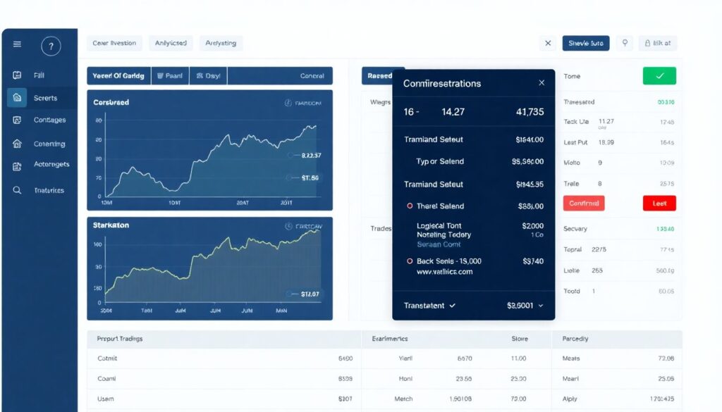
Start with explicit “view-only” positioning and enforce read-only scopes technically. When you add trading, put it in a separate area with clear warnings, double confirmations, and transparent fee explanations, and offer an easy way to stay in analytics-only mode.
How do I explain complex metrics like volatility to non-technical users?
Replace formulas with short, concrete sentences and examples. For instance, say “This asset’s price moves up and down more than most, so its value can change quickly” and pair it with a simple icon and an optional “Learn more” link for details.
What should I track to measure usability after launch?
Monitor time to first portfolio view, success rate of connection flows, frequency of help tooltip opens, and drop-off points inside critical journeys. Combine this with short, in-app feedback prompts focused on clarity and feelings of safety.
How do I handle discrepancies between on-chain data and exchange records?
Design for discrepancies as a normal case: flag mismatches, show what you expected vs what you received, and explain that data sources sometimes differ. Provide an easy way for users to report issues and document your reconciliation rules.
Do I need formal accessibility testing for my platform?
Yes, at least basic checks. Use automated tools for contrast and structure, then run sessions with users who rely on screen readers or keyboard navigation. Fix any blockers before broad launch, and repeat these tests when you release major UI changes.