Understanding token velocity without getting lost in jargon
What token velocity actually is (and what it is not)
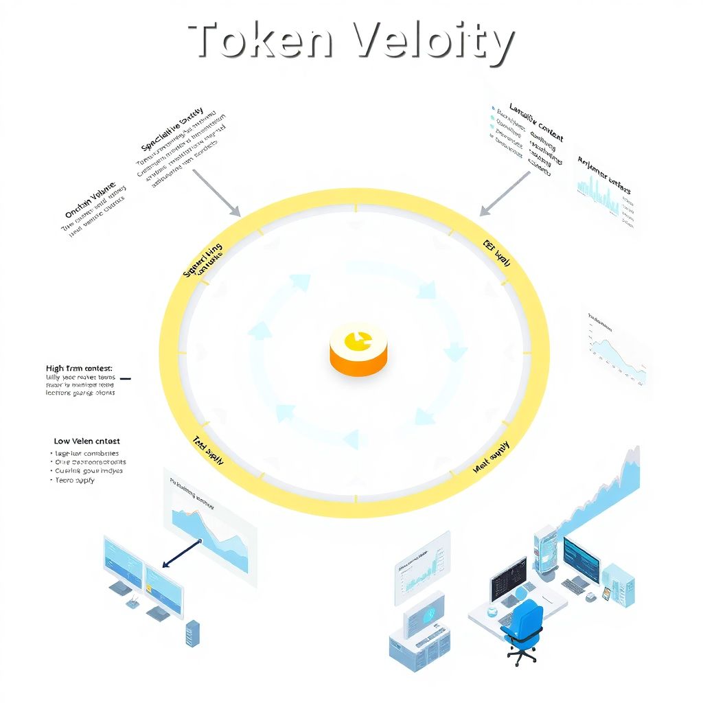
Token velocity is simply the speed at which a token moves between wallets over a period of time relative to its supply. In practice, analysts usually approximate it as: on-chain transaction volume over a period divided by circulating supply. The faster tokens move, the higher the velocity. That sounds neat, but it hides a trap: high velocity is not automatically “bad”, and low velocity is not automatically “good”. Velocity is context. Utility tokens in DeFi will often rotate quickly by design, while governance tokens of sticky protocols can stay idle for months and still support a healthy ecosystem. So your job as an analyst is not to judge the raw number, but to interpret it in the economic story of the project.
Velocity is also not just “trading volume”. A lot of beginners mix up token velocity with exchange volumes, ignoring that a massive chunk of trades happens inside centralized venues that barely touch the actual chain. That’s why any serious token velocity crypto investment strategy needs to separate on-chain flows (transfers, smart contract interactions) from speculative churn on exchanges. When you look only at CEX volume you are essentially watching a hall of mirrors, not money actually moving through the protocol’s economy.
Why velocity is a signaling metric, not a magic predictor
Investors love single metrics that magically predict price. Velocity won’t give you that. What it does give is a signal about how a token is *used* versus how it is *held*. A token with ultra‑low velocity might indicate strong conviction and long‑term holders. Or it might mean nobody cares enough to transact with it. You need surrounding data: active addresses, protocol revenues, staking ratios, distribution of holders and lockups. Only then velocity starts “speaking” as one piece of a coherent narrative rather than a lonely number on a dashboard.
On the flip side, persistently high velocity may signal a token is a short‑term trading chip, not a long‑duration asset. But be careful: high velocity around protocol launches, incentive programs, or big governance events can be perfectly rational. The value of token velocity and price prediction for altcoins lies not in a single snapshot but in how velocity co‑moves with catalysts, narrative shifts and macro liquidity. In other words, velocity is a heartbeat, not a horoscope.
—
Step‑by‑step: how to analyze token velocity before investing
Step 1: Define the token’s “job” in the ecosystem
Before touching charts, clarify what the token is *supposed* to do. Is it a fee token, a governance token, a reward token, collateral, or a blend of several roles? Each “job” implies a different healthy range of velocity. A gas token should rotate frequently; a collateral token might sit parked in vaults; a pure governance token can look dead between voting cycles. If you don’t map design to expected behavior, every number will feel either alarming or comforting for the wrong reasons. This design‑first mindset is where serious crypto tokenomics consulting token velocity analysis starts.
Write down, in one sentence, how value flows through the protocol and where the token sits in that flow. If you can’t do this in plain language, you are not ready to interpret any metric, including velocity. As a quick sanity hack, ask: “If this token disappeared, what exactly would stop working?” If the honest answer is “mostly incentives and vibes”, then velocity spikes likely mean mercenary farmers rotating through, not durable economic adoption.
Step 2: Pull the right velocity data instead of random dashboards
Next comes the data hunt. Most people Google a project, open the first analytics site they see, and start drawing bold conclusions from badly labeled charts. Resist that. You want transparent methodology and, ideally, the ability to inspect raw inputs. Some of the best crypto analytics tools for token velocity include on‑chain platforms like Nansen, TokenTerminal, Dune dashboards, or project‑specific explorers if they expose meaningful transfer data. When a project provides its own analytics page, don’t trust it blindly; treat it as marketing‑adjacent and cross‑check elsewhere.
When hunting data, make a rule: never use an indicator if you don’t understand how it’s calculated. If a dashboard just says “velocity” with no formula or explanation, park your curiosity but not your capital. Try to reconstruct a basic version yourself: total on‑chain transfer value for the token in, say, 30 days divided by average circulating supply in that window. Even a rough DIY calculation often exposes how wild some “official” metrics really are.
Step 3: Normalize for time, supply and market regime

Raw velocity numbers across projects are almost useless without normalization. A token that’s one year old with 15% of total supply circulating is not comparable to a five‑year‑old token with 90% circulating. Similarly, bull and bear markets imprint totally different behavioral patterns on holders. To apply token velocity crypto investment strategy in a disciplined way, standardize time windows (for example, 30D and 180D), track changes in circulating supply, and mark macro regimes on your charts.
Here’s a practical trick: plot velocity together with supply unlocks and price. If velocity spikes exactly when a big tranche of tokens unlocks and price slumps, you might be watching insiders or early investors selling into demand. If velocity rises while price rises and no major unlocks occur, usage‑driven demand is a more plausible driver. This simple triangulation already puts you ahead of most retail traders who see every spike as either pure bullishness or random noise.
Step 4: Separate utility‑driven velocity from speculative churn
Now you refine the signal. Look directly at *what* the token is being used for. Are transfers going into DEX pools, lending protocols, staking contracts, or just bouncing between exchange wallets? Ideally, you want to label smart contracts and addresses so velocity can be split into “productive” and “non‑productive” flows. Velocity from fee payments, collateral deposits, and governance interactions is very different from velocity created by bots wash‑trading on thin‑liquidity pairs.
This step is where you graduate from generic charts to real analysis. It transforms the vague question “Is velocity good or bad?” into the sharper question “Is this velocity aligned with the economic purpose of the token?” For example, in a lending protocol, a surge in deposits of the native token as collateral, combined with more borrowing demand, can justify both higher velocity and higher valuation. The same numeric surge, if dominated by exchange hot wallets, is a red flag disguised as activity.
Step 5: Build your own velocity “playbook” per sector
Different sectors of crypto exhibit distinct velocity signatures. DeFi tokens typically show cyclic patterns around incentive programs and yield changes. Gaming tokens might display bursts of in‑game spending around events, followed by long lulls. L1 and L2 gas tokens are chained to network activity and fee markets. Instead of looking for a universal threshold like “velocity above X is bad,” compile sector‑specific patterns and anchor each new project to that backdrop.
A practical habit: for each sector you actively invest in, pick three mature benchmark projects and archive their historical velocity patterns through different cycles. When you later analyze a new altcoin, compare its velocity history to those benchmarks. If a DeFi protocol shows promo‑driven spikes that look eerily like mercenary farming in older failed projects, treat that echo as a warning. Over time, this comparative approach quietly upgrades your intuition from feeling‑based to data‑trained.
—
Reading the signals: what rising or falling velocity can mean
Bullish interpretations that actually make sense
Velocity rising while unique active addresses, TVL or protocol revenue are also rising often signals genuine adoption. More users, more economic activity, more token circulation in service of real usage. If at the same time the share of tokens in long‑term holdings or staking remains high, you get a neat tension: many tokens are locked, the free float rotates quickly for utility, and any incremental demand can pressure price up. In narrative‑driven markets, this combination can be powerful, especially for token velocity and price prediction for altcoins with smaller float and strong story.
Another underrated bullish pattern is a slow, steady rise in velocity around recurring protocol operations rather than one‑off events. For example, regular buy‑backs, fee distributions, or in‑app sinks that require spending the token. Here the story is not about parabolic growth but about structural embedding of the token into user behavior. Analysts who spot these slow‑burn patterns early can position themselves long before social media catches up.
Bearish interpretations that newcomers often overlook
On the bearish side, when velocity spikes jointly with exchange inflows and no obvious utility shock, it often means someone is rushing to liquidity. Large holders sending tokens to centralized exchanges and a jump in short‑term transfers is a classic precursor to sell pressure. Another bearish hint is high velocity with flat or falling fundamental metrics: same or fewer users, stagnant revenue, declining on‑chain activity outside pure token transfers. In that case, the token is mostly a hot potato.
Newcomers often misread low velocity as automatically bullish because “everyone is holding”. But if the protocol is young, has modest traction, and yet tokens barely move, you might just be looking at frozen supply waiting for liquidity to arrive so it can exit. A good stress test is to ask: “If incentives stopped tomorrow, would anyone still need this token?” If the answer is no, then low current velocity is more like a calm before potential exit waves, not a vote of confidence.
—
Common mistakes and how to avoid them
Overfitting your thesis to a single timeframe
One frequent error is cherry‑picking a timeframe that supports whatever you already want to believe. Bulls highlight 7‑day spikes that “prove demand”, bears show 90‑day declines that “prove decay”. Robust analysis checks multiple windows: intraday, weekly, monthly, and cycle‑level. When short and long timeframes tell conflicting stories, slow down and dig deeper into catalysts, token unlocks and macro market shifts before you reach conclusions.
To fight your own bias, formalize a mini‑checklist: look at at least three timeframes and jot down for each whether velocity is up, flat or down, and how that lines up with price and fundamentals. Treat any strong conviction that appears before running this checklist as suspect. This small ritual doesn’t eliminate bias, but it forces your brain out of autopilot, especially when you’re emotionally invested in a bag.
Confusing engineered activity with organic usage
Projects can game surface‑level velocity by airdrops, pointless “quest” systems and circular incentive schemes. It all looks like engagement on‑chain, but economically it’s dead weight. The core tell is that when incentives are reduced, activity collapses. If your whole thesis rests on elevated velocity during these programs, you are essentially paying attention to a stimulus bubble. When people talk about how to analyze token velocity before investing, they rarely admit how much time they spend just filtering out this noise.
A simple defensive trick: whenever you see a jump in velocity, ask “What changed in user incentives?” Check announcements, governance forums, and social channels. If you can’t find a non‑monetary reason—like a new feature, real business integration, or major UX improvement—the default assumption should be that the spike is subsidized. Then you analyze whether that subsidy is building lasting habits or only attracting coupon‑clippers.
—
Non‑standard tactics to use token velocity like a pro
Make “velocity divergences” your early‑warning radar
A creative use of velocity is to hunt for divergences: cases where velocity and price move in opposite directions for longer than a brief blip. For instance, if price keeps grinding up while velocity steadily falls, you may be seeing a transition from speculative trading to long‑term holding by stronger hands, which can be healthy—up to a point. But if velocity collapses below historical norms while user metrics stagnate, the rally might be running on fumes.
Conversely, rising velocity with flat price can mean the market is still mispricing growing usage. If you see more tokens moving through productive contracts, more distinct addresses participating, and yet the chart barely budges, that’s an information edge. You can treat it as a lead indicator that the narrative will eventually catch up to the data. In this sense, velocity divergences become a tool for asymmetric bets rather than just a diagnostic metric.
Build lightweight, personal “shadow dashboards”
Here’s another unconventional idea: don’t rely solely on big providers. Build your own slim, opinionated dashboards that track only the few velocity‑adjacent metrics you truly care about for each asset. You can use public APIs or even spreadsheets that pull in on‑chain data via simple scripts. The point is not to re‑create Bloomberg; it’s to compress the noisy firehose into something you can actually read and act on weekly.
This personal layer also immunizes you somewhat against narrative swings. When social media screams “usage is exploding”, you can calmly glance at your shadow dashboard and see if your own velocity plus fundamentals composite agrees. Over time, that habit trains your intuition to lean on structured evidence instead of sentiment cycles, which is exactly the edge you want in a field where everyone has access to the same public charts but few interpret them consistently.
—
Practical tips for beginners using velocity in real portfolios
Start with tiny bets and post‑mortems, not bold convictions

If you’re new, treat velocity‑based theses as experiments. Allocate small capital to a few ideas explicitly driven by your velocity analysis, then document your reasoning: what pattern you saw, what you expected, and over what horizon. After a few months, revisit. Did price action and fundamentals follow your script or not? These post‑mortems are worth more than any thread you’ll read online.
Gradually, you’ll notice which sectors, timeframes and signal combinations you understand best. Maybe you’re good at spotting exit‑driven spikes in small caps, or at identifying underpriced utility growth in mid‑cap DeFi. Lean into those strengths and ignore areas where velocity keeps fooling you. That’s how a vague interest in metrics evolves into a coherent, personalized framework that anchors your broader investment practice.
Integrate velocity into a wider decision framework, not as a hero metric
Finally, remember that velocity is one node in a graph of evidence: token design, team quality, competitive landscape, regulatory risk, and plain old market psychology. A durable token velocity crypto investment strategy treats velocity as one of several weighted signals, never the sole driver. If every other pillar looks weak—a confused business model, opaque treasury, hostile regulation—no amount of clever velocity pattern‑matching should justify a large position.
Used with humility, velocity is a sharp tool: it helps you see how a token actually circulates in the wild, beyond whitepapers and pitch decks. Used as a hammer, it tempts you into overconfidence and overfitting. The edge lies not in having access to these numbers, but in asking harder questions than the next person—and being willing to admit when the story they tell does not fit the trade you wanted to make.

