
Why the credibility of on-chain dashboards actually matters
Scroll through Crypto Twitter for ten minutes and you’ll see the same thing: screenshots from some “must‑see” on-chain dashboard, followed by bold conclusions about tops, bottoms or “smart money” moves.
The uncomfortable truth: many of those charts are either misunderstood, poorly built, or straight‑up misleading. Evaluating the credibility of on-chain dashboards is now a survival skill, not a luxury.
Below is a practical, hands‑on framework to help you judge whether to trust a crypto on-chain metrics dashboard before you let it influence your decisions.
—
A bit of history: from raw nodes to polished dashboards
In the early days of Bitcoin, if you wanted on-chain data, you basically had two options:
1. Run a node and parse the raw blockchain yourself.
2. Rely on a couple of hobbyist websites with basic charts like transaction count and hash rate.
As Ethereum and DeFi exploded, the situation changed:
– More complex protocols (DEXes, lending, bridges) created richer on-chain traces.
– Analysts started building custom SQL queries and sharing charts on community platforms.
– Professional products emerged, competing to be the best on-chain analytics platforms for funds, market makers and advanced traders.
That’s when glossy, highly visual dashboards took off. But while the UX improved, the underlying problems stayed:
– Different data pipelines give different numbers for the same metric.
– Definitions of “active users”, “TVL”, “whales”, “real volume” vary wildly.
– Many dashboards are made by individuals with zero documentation or peer review.
So now we have a paradox: getting on-chain data is easier than ever, but telling whether a dashboard is trustworthy is often harder than reading the raw chain.
—
Core principles for judging credibility
Principle 1: Transparency beats aesthetics
A dashboard can look amazing and still be junk. Credible dashboards show you:
– What data source they use (own nodes, third‑party provider, public indexer).
– How the metric is defined.
– Which contracts, chains and time ranges are included or excluded.
When you evaluate on-chain data dashboards for crypto trading, ask yourself a blunt question: *Could I, in theory, reproduce this chart if I had time and skills?*
If the answer is “no idea, they don’t even hint at the logic”, that’s a red flag.
—
Principle 2: Definitions must be precise
Words like “user”, “volume”, “TVL”, “whale”, “smart money” sound obvious, but they’re not.
Credible dashboards pin these down:
– “User” – wallet address, EOA only, or also contracts?
– “Volume” – sum of trade notional, or only filled orders? Includes self‑trades?
– “TVL” – raw token balances, or adjusted for token price and protocol ownership?
– “Whale” – balance threshold, transaction size, or profit history?
A trustworthy crypto on-chain metrics dashboard might literally define in a caption:
“Whales = addresses with ≥ 10,000 ETH balance at any time in the last 30 days.”
That level of precision is what you’re looking for.
—
Principle 3: Methodology > narrative
Dashboards are often built backward: someone has a thesis (“retail is capitulating”, “institutions buying the dip”) and then searches for metrics that “prove” it.
Flip the process in your head:
– Start with the *methodology*: what is this chart actually measuring, step by step?
– Then inspect the *assumptions*: are they reasonable, or cherry‑picked?
– Only then consider the *narrative*: does the story follow from the numbers, or is it forcing them?
When you do an informal blockchain analytics tools comparison, many platforms will look similar on the surface. The real difference is hidden in their methodology pages, query logic, and how honestly they communicate limitations.
—
Practical checklist: how to choose on-chain analytics platform

Here’s a short, practical checklist you can run through in a few minutes when you’re deciding how to choose on-chain analytics platform or whether to trust a specific dashboard inside one:
– Source clarity
– Does the platform tell you where the data comes from (own infra vs. third‑party vs. public indexer)?
– Is there a status page or data‑latency indicator?
– Metric documentation
– Are key metrics linked to docs, blog posts or at least a description?
– Do they mention edge cases (bridges, MEV, L2s, token migrations)?
– Methodological openness
– Can you see the underlying query or logic, even partially?
– Is there a way to fork / edit the dashboard if it’s community-based?
– Versioning and changelogs
– Do they log changes in logic (“We changed how we define DEX volume as of date X”)?
– Are previous numbers updated consistently, or silently shifted?
If most of these are “no”, don’t base any serious decision—especially trading—on it.
—
Practical examples: what credible implementation looks like
Example 1: Exchange flows and fake “capitulation”
Imagine a dashboard that claims: “Huge BTC outflows from exchanges – bullish signal!”.
Before reacting, you’d ask:
1. Which exchanges? Only a few CEXes, or all major ones?
2. Which chains? BTC mainnet only, or wrapped BTC on Ethereum and other chains too?
3. Are internal transfers filtered out? Exchanges constantly reshuffle funds between hot and cold wallets.
A credible dashboard here would:
– Tag known exchange wallets and show coverage (e.g., “Top 20 exchanges by volume, ~85% coverage”).
– Exclude clear internal transactions (same owner, multi‑sig rebalancing).
– Show a long‑term baseline so you can see if the current “outflow” is actually unusual.
Once you’ve seen a few such careful implementations, lazy ones become very obvious.
—
Example 2: “Active users” on a new DeFi protocol
You see a dashboard boasting 200k “active users” in the last month. Sounds impressive. But what’s behind that number?
Good dashboards will clarify:
– Does each wallet count once per day, per week, or just once total?
– Are airdrop‑farmers and bots filtered? How?
– Are only direct contract interactions included, or also transfers of the protocol’s token?
A robust implementation might:
– Require a certain minimum interaction size or gas spend to classify “real” users.
– Use heuristics to cluster obvious bot farms (e.g., many sequential calls from similar addresses).
– Clearly separate “unique addresses” and “likely humans”.
If definitions are vague, the user metric is closer to marketing than data.
—
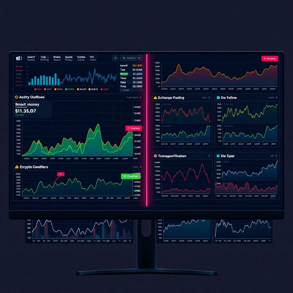
Example 3: Profitability of “smart money” wallets
“Smart money dashboards” are trendy—and often abused.
A credible setup would:
– Define “smart money” by consistent, long‑term profitability over many cycles, not just one lucky trade.
– Include *realized* PnL, not just mark‑to‑market balances.
– Handle token airdrops, vesting, and OTC deals where on-chain price is not representative.
In practice, that means the platform needs quite advanced labelling and tracking. If a dashboard simply calls “any wallet that bought early and is now rich” smart money, treat its signals as entertainment, not edge.
—
How to stress‑test a dashboard before you trust it
You don’t need to be a data engineer. There are simple, user‑level tests you can run.
1. Sanity‑check against other sources
If a dashboard claims, “Protocol X has $20B TVL,” you can:
– Cross‑check with at least one other platform.
– Check the protocol’s own stats page (if it exists).
– Look at market cap and rough liquidity—does $20B even make sense?
Huge discrepancies don’t necessarily mean someone is lying, but they signal that the underlying definitions differ. That’s where a mini mental blockchain analytics tools comparison helps: which definition suits your use case better?
—
2. Test sensitivity to inputs
Change a few things on the dashboard:
– Switch timeframes (daily vs weekly vs monthly).
– Toggle chains or protocols on/off.
– Move from linear to log scale if possible.
You want to know: *Is the conclusion robust, or does it flip with minor parameter changes?*
A credible dashboard will give you a similar directional story under multiple reasonable parameter sets. If the conclusion is fragile, don’t lean too heavily on it.
—
3. Look for error bars and caveats
Serious analytics tools admit uncertainty. For example:
– “L2 data delayed by ~1h compared to mainnet.”
– “Bridge tags incomplete; numbers may be understated.”
– “Margin of error estimated at ±5–10%.”
If a dashboard presents everything as absolute truth with no caveats, it’s probably overconfident or aimed more at marketing than analysis.
—
Common misconceptions about on‑chain dashboards
Misconception 1: “It’s on the blockchain, so it must be accurate”
Yes, the blockchain data itself is immutable. But:
– Labelling (which address is an exchange, bridge, MEV bot) is probabilistic.
– Clustering (grouping addresses that belong to one entity) is heuristic.
– Aggregation (TVL, volume, fees) often relies on token prices, which come from off‑chain oracles and APIs.
Dashboards are *interpretations* of raw data, not the raw data itself. That interpretation layer is exactly where bias, error and sloppy thinking sneak in.
—
Misconception 2: “More metrics = more insight”
Some dashboards throw 30 charts at you: addresses, volume, TVL, age distribution, realized cap, SOPR, whale moves, funding rates, NVT, and so on.
In practice:
– 2–3 well‑understood metrics with clear definitions beat 20 poorly‑defined ones.
– Extra charts can create confirmation bias: you’ll inevitably find *something* that supports your existing view.
A simple rule of thumb: if you can’t explain how a metric is calculated to another person in plain language, don’t trade size based on it.
—
Misconception 3: “Paid tools are always better than free ones”
Some of the best on-chain analytics platforms are indeed paid, with serious teams, auditing and infra behind them. But price alone doesn’t guarantee quality.
Free or community‑based dashboards can be:
– Extremely transparent (queries visible, debates in comments).
– Specialized in niches that big tools under‑serve (obscure chains, specific DeFi verticals).
– Faster to adapt when protocols upgrade or change contract logic.
Conversely, some slick paid products hide their methodology behind “proprietary algorithms” and offer little verifiability. Always judge on transparency and consistency, not subscription cost.
—
Integrating dashboards into real trading and investing
For active traders
If you’re using on-chain data dashboards for crypto trading, try to:
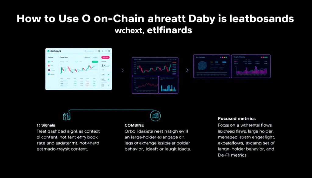
– Treat dashboard signals as *context*, not hard entry/exit triggers.
– Combine them with order‑book, funding, and macro context.
– Focus on a small set of repeatedly useful metrics (e.g., exchange flows, large holder behaviour, DEX + CEX volume patterns).
You’ll build intuition about which dashboards deserve trust as you see how they perform around volatile events.
—
For long‑term investors
For longer horizons, credible dashboards help you:
– Track protocol fundamentals: revenue, user retention, fee growth.
– Monitor concentration risk: large holders, team wallets, unlocks.
– Watch for structural shifts: L1 to L2 migration, bridge usage, multi‑chain deployments.
The key is consistency: pick a few platforms and dashboards that pass your credibility checks and follow them over months. You’re looking for stable methodology over hype.
—
Final thoughts: treat dashboards like research papers, not headlines
On-chain dashboards can absolutely give you an edge—but only if you approach them with a critical, almost scientific mindset:
– Ask how the data is sourced and processed.
– Demand clear definitions and transparent assumptions.
– Cross‑check with other sources when the numbers really matter.
– Recognize that every dashboard encodes someone’s model of reality, not reality itself.
If you keep that attitude, the on-chain world stops being a firehose of confusing charts and starts becoming what it should be: a rich, inspectable dataset you can use to make better, more grounded decisions.