

Why systemic risk in crypto feels invisible — until it explodes
Most people only notice “systemic risk” in crypto when something already broke: Terra in 2022, FTX later that year, cascading liquidations in DeFi in March 2020. But by the time Twitter starts screaming, the real damage is baked in. The uncomfortable truth is that systemic risk indicators usually exist weeks or even months before a crash; the hard part is knowing where to look and how to interpret them without drowning in noise.
If you manage a fund, run a protocol, or even just hold a decent‑sized portfolio, you can’t rely on vibes and headlines. You need a structured way to read the early warning signs: liquidity fragility, leverage concentration, reflexive feedback loops, and correlated exposures hidden behind wrappers and bridges. Let’s break down how different approaches try to identify these signals, what they miss, and how to combine them into something actually useful.
—
Three layers of systemic risk in crypto ecosystems
Before comparing methods, it helps to separate systemic risk into three layers. First, there’s market‑level risk: macro shocks, liquidity droughts, cross‑asset correlations spiking to 1.0, and sudden changes in funding conditions. Second, you have infrastructure‑level risk: stablecoins, major exchanges, custodians, L2s, bridges — chokepoints whose failure radiates across the whole system. Third, there’s protocol‑level risk: design flaws in lending markets, AMMs, yield aggregators, and perpetual DEXs that can turn a normal price move into a liquidation cascade. Different analytical approaches are better at different layers, and that’s where a lot of confusion comes from: using a good tool for the wrong job and then blaming “unpredictable markets” when it fails.
The core idea: systemic events rarely come from a single black swan; they come from weak links at all three layers aligning at the worst possible time.
—
Approach 1: Traditional market data and risk metrics
The most familiar approach borrows heavily from TradFi: look at prices, volumes, volatility, correlations, and build models on top of that. You might use realized and implied volatility, cross‑asset correlation matrices, order book depth, and funding rates from perpetual futures. This is essentially what any serious crypto market risk analysis platform does: plug into exchanges, normalize data, and generate metrics like Value-at-Risk (VaR), expected shortfall, and stress scenarios. It’s fast, scalable, and relatively mature compared to on-chain analytics.
This lens is actually decent at spotting systemic risk tied to liquidity and leverage on centralized venues. For example, ahead of the May 2021 crash, perpetual funding rates on major exchanges had stayed strongly positive for weeks, with some altcoins showing annualized rates above 100%. That was a bright red indicator of crowded leveraged longs. Combine that with thinning order books and you had all the ingredients for a liquidation spiral once prices turned.
The big limitation: this approach mostly “sees” what’s on centralized order books and derivatives markets. It underestimates hidden leverage in DeFi, ignores protocol design risk, and tends to assume that market structure stays stable. In crypto, that assumption ages badly.
—
Technical note: core quantitative indicators
From a technical standpoint, classical systemic risk indicators in this camp include:
– Cross-asset correlations: rolling 30–90 day correlations between BTC, ETH, majors, and key alt sectors. A sharp rise toward 0.8–0.9 across the board signals lower diversification and higher systemic vulnerability.
– Liquidity depth: USD notional to move the midprice by 1–2% on major exchanges. Sharp declines in depth (e.g., >40% drop over a month) are early warnings of fragile markets.
– VaR and expected shortfall: using historical or Monte Carlo methods on returns data. For systemic risk, the focus is on clustering of large drawdowns, not just single‑day moves.
– Basis and funding rates: sustained extreme positive funding on perpetuals or steep futures contango (e.g., >20–30% annualized) indictate leverage‑driven price levels prone to disorderly unwinds.
—
Approach 2: On‑chain analytics and network‑level signals
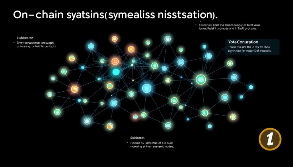
The second major approach focuses on blockchain analytics for systemic risk. Instead of looking only at prices and volumes from exchanges, it tries to map how value, leverage, and dependencies flow through the on‑chain graph. Think: how much collateral is rehypothecated, where stablecoins actually sit, which contracts have a disproportionate share of TVL, and how tightly connected bridges and oracles are.
A good example is the Terra/UST collapse. On-chain data was screaming months in advance: extreme concentration of UST demand in a single protocol (Anchor, with yields ~20%), circular flows of capital (LUNA price propping up UST confidence, which pumped Anchor deposits, which pumped LUNA again), and huge chunks of UST liquidity sitting in relatively shallow pools. A robust crypto portfolio risk assessment service that traced flows between UST, LUNA, Anchor, Curve pools, and exchanges could have flagged systemic dependence on a single unstable mechanism instead of treating UST as a generic “stablecoin” factor.
The strength of this approach is structural visibility: it sees who depends on whom. The weakness: it’s easy to drown in detail, misinterpret raw flows, or miss off‑chain chokepoints like custodians and market makers that don’t fully show up on-chain.
—
Technical note: key on-chain systemic indicators
On-chain systemic risk detection typically relies on graph and state analysis, including:
– Entity concentration: fraction of a token’s supply or TVL held by the top N addresses or contracts. For stablecoins, if more than ~40–50% sits in a few DeFi protocols, those become systemic nodes.
– Dependency graphs: directed graphs where nodes are protocols/contracts and edges represent value, collateral, or oracle dependencies. High centrality scores (e.g., betweenness, eigenvector) flag systemically important protocols.
– Collateral reuse and leverage loops: detecting patterns where the same asset backs multiple derivative or synthetic exposures across platforms, amplifying effective leverage.
– Bridge and oracle exposure: measuring what fraction of total DeFi TVL, stablecoin supply, or derivatives notional depends on a single bridge or price feed.
—
Approach 3: DeFi-specific stress testing and simulation
The third approach treats DeFi more like a programmable financial system and less like a black box. Instead of only reading current state, it asks: “What happens to this web of contracts if we shock certain variables?” That’s where agent‑based simulations, protocol‑level stress testing, and scenario engines come in.
In practice, this can look like: simulating a 40% drop in ETH over 24 hours, combined with a 60% reduction in DEX liquidity and a temporary oracle lag, then watching how lending protocols, CDPs, and AMMs behave. Where do liquidations cluster? Which protocols suffer from bad debt? Does a stablecoin lose its peg because its collateral gets liquidated too slowly or too aggressively? This is how some institutional crypto risk monitoring solutions try to build “crash rehearsal” environments for large allocators and protocol treasuries.
The upside is clear: you can test very specific “what if” scenarios, including never‑seen‑before combinations of shocks. The downside: simulations are only as good as their assumptions; protocol upgrades, governance decisions, and new attack vectors can quickly invalidate a static model.
—
Technical note: building a DeFi stress testing engine
A realistic DeFi stress test usually needs:
– State snapshotting: capturing on-chain positions (collateral, debt, LP shares) across major protocols at a given block.
– Behavioral models: simple heuristics for liquidators, arbitrageurs, and panic sellers (e.g., liquidation thresholds, gas constraints, slippage tolerance).
– Price and liquidity shock generators: configurable trajectories (jumps, drifts, volatility spikes), plus dynamic AMM curves to recalculate pool states.
– Feedback mechanisms: liquidations causing further price impact, which triggers more liquidations — capturing reflexivity instead of assuming independent events.
—
Approach 4: Centralized infrastructure and off‑chain concentration
A lot of systemic risk in crypto doesn’t live on-chain at all. It lives in centralized exchanges, custodians, prime brokers, banks, and fiat ramps. This was painfully obvious with FTX and, earlier, with Mt. Gox. On-chain data was not going to tell you that an exchange was secretly rehypothecating customer assets, running huge directional bets, or fabricating internal balances.
To catch this kind of risk, you need a different toolkit: exchange reserve monitoring, proof‑of‑reserves scrutiny, operational risk audits, and behavior‑based red flags. For instance, sudden changes in withdrawal friction, obscure token listings used as collateral, abnormal internal transfer patterns to OTC desks, or high correlation between an exchange’s native token price and its lending activity.
This is where many crypto risk management tools try to blend on‑chain signals (exchange hot wallet flows) with off‑chain data: regulatory filings, news, lending terms, and even social‑graph signals from OTC desks and funds.
The challenge: opacity. Most of this infrastructure is intentionally private, and even sophisticated actors get blindsided without privileged information.
—
Technical note: practical centralized risk indicators
For centralized chokepoints, practitioners track:
– Exchange concentration: share of total spot and derivatives volume, plus share of stablecoin reserves, controlled by the top 2–3 venues. High concentration increases systemic fragility.
– Reserve dynamics: rapid net outflows of BTC/ETH/stablecoins from an exchange (e.g., >15–20% of its known reserves over a few days) often precede stress events or loss of confidence.
– Native token entanglement: how deeply an exchange’s own token is integrated into collateral and fee structures. The FTT collapse showed how a reflexive internal token can vaporize balance sheets.
– Legal and jurisdictional clustering: multiple key providers sharing the same regulator, banking partner, or legal structure, creating hidden correlation in regulatory risk.
—
Comparing the approaches: what each sees — and what each misses

To see the trade‑offs clearly, imagine each approach as a camera with a different zoom and filter. Market‑data models have a wide macro lens: they catch volatility storms and leverage mispricing quickly but treat protocols and infrastructure as interchangeable blobs. On-chain analytics are like a network scanner: they see structural vulnerabilities, but often lag in fast market moves and miss off‑chain deals. Stress testing is like a simulation lab: great for hypothetical disasters, weaker for day‑to‑day early warnings. Centralized infrastructure analysis is more like investigative journalism: depth where you have access, blind spots where you don’t.
In practice, systemic events rarely sit neatly in one bucket. Terra/UST was a blend: on-chain circular dependencies, shallow liquidity, and off‑chain narrative momentum. FTX was mostly centralized rot, but its failure propagated through on‑chain lending markets and token collateral. March 2020’s “Black Thursday” combined macro shock, CEX liquidations, oracle issues, and under‑provisioned liquidators in Maker. Any single methodology on its own would have produced only a partial picture.
—
Hybrid, layered monitoring: the only thing that consistently works

The more serious players have converged on a layered strategy. At the top, they run continuous market‑level monitors: volatility regimes, liquidity metrics, cross‑asset correlations, derivatives funding, and stress spreads between majors and alt sectors. These provide the “weather report” and feed alerting systems when the probability of extreme moves increases.
Under that, they maintain structural maps of the ecosystem: how stablecoins, bridges, L1/L2s, and big DeFi protocols connect. Here, blockchain analytics for systemic risk is essential: graph metrics, dependency mapping, and concentration analysis. On top of this map, they deploy targeted stress tests: “What if this bridge fails?” “What if this stablecoin depegs by 5% for 24 hours?” “What if gas fees spike 10x during a crash?” This approach doesn’t remove uncertainty, but it transforms unknown unknowns into scenarios with actionable responses.
The end result isn’t a magic red “sell everything” button; it’s a playbook. For example: if stablecoin concentration in a single protocol exceeds pre‑defined thresholds while market liquidity is thin and volatility is rising, risk teams might cut exposures, tighten collateral lists, or cap leverage before the crowd reacts.
—
Institutional angle: turning indicators into processes
Institutions can’t operate on gut feelings and sporadic dashboards. They need repeatable processes, audit trails, and defensible rationales for their decisions. That’s driving the emergence of integrated services that combine quant signals, on-chain data, and qualitative risk scoring into a single workflow. A serious crypto risk management stack today might include a crypto market risk analysis platform for exchange and derivatives data, plus a dedicated on-chain analytics engine and policy automation.
For example, a fund might define rules like: “If BTC–altcoin correlation (30‑day) exceeds 0.85 and aggregate DEX stablecoin liquidity drops by more than 30% from its 90‑day average, automatically reduce leverage by X% and move Y% of collateral into short‑duration treasuries or fully‑backed stablecoins.” In this context, crypto risk management tools are less about “prediction” and more about disciplined reaction to well‑defined systemic risk indicators — before panic sets in.
This is also where an enterprise‑grade crypto portfolio risk assessment service can differentiate itself: not just providing charts, but encoding policies, thresholds, and workflows that align with the institution’s mandate and risk appetite.
—
Key real‑world signals that consistently mattered
Looking across the major crypto crises of the last five years, a few categories of indicators show up almost every time. First, leverage imbalances: extreme funding rates, high open interest relative to spot market cap, and leveraged yield farming with thin real liquidity. Second, concentration: too much economic weight in a single stablecoin, bridge, DEX, or exchange; or too much protocol revenue tied to one volatile asset.
Third, maturity mismatch: protocols or lenders promising short‑term liquidity against long‑dated or illiquid collateral. Celsius and other CeFi lenders in 2022 had large exposure to staked ETH and GBTC while offering near‑instant withdrawals. Fourth, governance and upgrade risk: complex protocols with opaque or rushed governance paths, where a small set of actors can change core parameters under stress. Nearly every major incident had at least two of these elements in play.
If you’re building your own monitoring, bake these themes directly into your indicator set instead of chasing dozens of independent signals that you never act on.
—
Where the tooling is going next
The direction of travel is fairly clear: from dashboards to integrated decision systems. Instead of separate tools for on‑chain flows, market data, and policy checks, the industry is inching toward unified platforms that can ingest all three and trigger automated or semi‑automated actions. Think: a crypto market risk analysis platform that not only shows that bridge dependence crossed a threshold but also automatically adjusts margin requirements on affected assets.
On the enterprise side, expect more sector‑specific institutional crypto risk monitoring solutions: one tuned for stablecoin issuers, one for DeFi lenders, one for exchanges, each with playbooks tailored to their failure modes. For individuals and smaller funds, the good news is that many of the core data feeds are public; you can approximate a “poor man’s” systemic risk lab with open on‑chain explorers, derivatives data, and some scripting, even if you won’t hit institutional depth.
—
Putting it into practice: a minimal but robust workflow
If you want a pragmatic starting point without building a full data science team, you can follow a simple tiered approach. At the baseline, track market‑wide volatility regimes, BTC and ETH dominance, stablecoin market cap changes, and CEX funding rates. Add alerts for sudden spikes and regime shifts.
At the structural layer, focus on a handful of critical nodes: the top stablecoins, major bridges, dominant lending markets, and the L1s/L2s you actually use. Monitor TVL concentration, collateral composition, and signs of circular dependencies. Finally, run periodic scenario reviews: pick 2–3 adverse scenarios per quarter (e.g., a stablecoin depeg, a bridge exploit, a regulatory hit) and ask how your portfolio, protocol, or business would behave — then adjust exposures and operational plans accordingly.
You don’t need to anticipate the exact form of the next crisis. You just need to make sure you’re not dependent on a single fragile assumption anywhere in the stack.
—
Conclusion: systemic risk is a pattern, not a surprise
Systemic risk in crypto ecosystems isn’t some mystical black box; it’s the visible outcome of leverage, concentration, and complex dependencies lining up in ugly ways. Different analytical approaches each illuminate a piece of that puzzle: market‑data modeling, on-chain graph analysis, DeFi stress testing, and centralized infrastructure scrutiny.
If you treat any one of them as gospel, you will eventually miss something critical. But if you combine them into a layered monitoring framework, supported by clear policies and thresholds, you shift from “reacting to blow‑ups” to managing structural fragility. That’s ultimately what good crypto risk management tools, services, and processes should deliver: not certainty, but enough foresight to step aside before the avalanche starts.